By Elizabeth Hudson
Getting a rebrand right is about much more than simply developing a shiny new logo. The right logo conveys what an organisation is about, communicating its personality as much as its function.
For a long time, Wellspring branding was classic red and grey, with a formal typeface – smart and professional, but perhaps a little too corporate. As we approached our 10 year anniversary, it seemed right to look again at things and see if our image matched the organisation as it is in 2022. The verdict? It was time for a change.
At Wellspring, our aim is to enable schools to be joyful, inspiring and vibrant places. Yes, of course we take our professionalism seriously (the books still need to balance, legislation needs to be understood and followed, and buildings need to be properly managed) but ultimately we’re about children. We’re about improving children’s lives and life chances, and making them feel safe and valued whilst also helping them have plenty of fun along the way.
With this in mind, we knew the new branding had to reflect that we are primarily an organisation focused on children and their wellbeing. We needed something that conveyed creativity, playfulness and fun whilst not detracting from the professionalism of Wellspring. We also wanted to communicate the fact that Wellspring is a community of schools, not a top down management organisation.
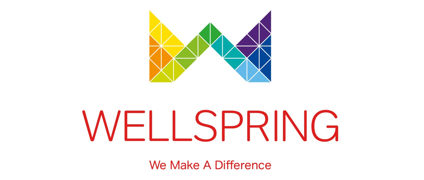
Our designer took that all on board brilliantly and created our fabulous new logo and branding. The familiar Wellspring logo shape stayed but a bright, colourful mosaic tile effect was introduced to bring it right up to date. The different colours comprising the mosaic are taken from the individual logos of our schools, ensuring that we represent everyone who, when combined, make up the Wellspring community. A more modern, simple typeface completes the new look.
We reckon the brand refresh now much better reflects the dynamic, forward-thinking nature of Wellspring in 2022, and gives us a brand identity perfect for pushing forward to the next 10 years. We’d love to hear what you think…
